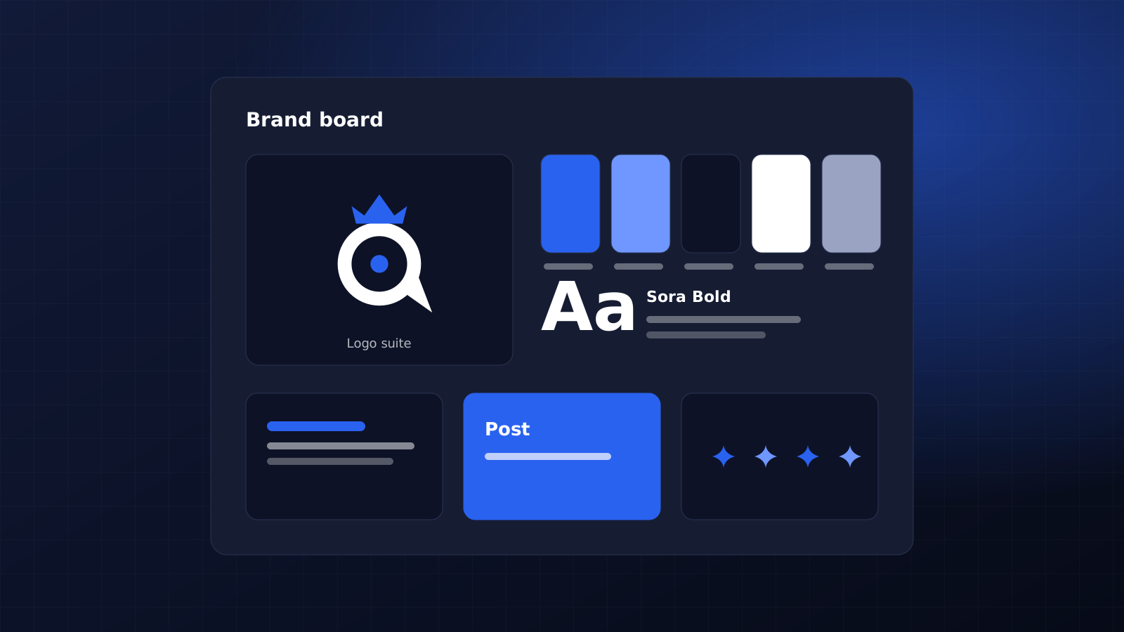
To create a brand style guide, write down the decisions people keep asking you about: which logo file to use, the colour codes, the fonts and how the brand should sound. Then add the numbers that stop guesswork, such as clear space, minimum logo sizes and contrast ratios. Most founders need one to twelve pages.
01.What a brand style guide needs to settle
A brand style guide is a short set of rules that keeps your logo, colours, type and writing the same everywhere they appear, from your website and proposals to LinkedIn, invoices and the banner at a trade show. It is written for the people who make things for you when you are not in the room.
Most brand guidelines fall short in the same place. They show the logo on a clean background, list five adjectives and stop. Nobody learns how small the logo can go, which grey to use for body text, or whether the company writes licence or license. A designer, a virtual assistant or a new hire will ask exactly those questions in their first week.
A style guide works when someone you have never met can make a correct asset without messaging you.
So write each rule as a decision with a number or an example attached. "Use plenty of white space" is a wish. "Keep clear space around the logo equal to the height of the letter O" is a rule anyone can check.
02.Start with what you already publish
Before you open a template, collect the last 20 or so things your business has put out: social posts, a proposal, an invoice, your email signature, the website header and a slide from your last pitch. Lay them side by side. The drift shows up fast, with three versions of the logo, two shades of blue and a heading font that only appears on Instagram.
Every inconsistency you find becomes a line in the guide. That keeps the document tied to real work, so it covers the choices your team makes each week and skips pages nobody will open.
Length follows from the audit. A solo consultant can fit everything on one page, while a founder with a small team, a website and printed material needs somewhere between five and twelve pages. If you are still unsure who you serve or what you want to be known for, settle that first through brand strategy work, because a style guide records decisions and cannot make them for you.
03.Logo rules with real measurements
Open the logo usage page by listing each version you have and where it goes. Four versions cover most small businesses:
- Primary logo: website header, proposals, anything with room around it.
- Horizontal or stacked version for narrow spaces such as email signatures and web banners.
- Icon or monogram, the mark without the name, used for social profile pictures and the browser favicon.
- One-colour versions in black and in white. You will need these for dark photos, embroidery, rubber stamps and anything printed in greyscale.
Set clear space using a part of the logo itself, such as the height of the first letter, so the rule scales with the file. Then set a minimum width for screen and for print. Find it by testing: shrink the logo on your phone until the name gets hard to read, add a margin, and write that width down in pixels and millimetres.
The icon needs its own check. Google can show your favicon beside your search results, and it asks for a square image of at least 8 by 8 pixels, ideally larger than 48 by 48. A wide wordmark squeezed into that square turns into a smudge, which is why the icon version exists.
Finish the page with three or four pictures of what not to do: stretched, recoloured, rotated, or placed on a busy photo. People copy a picture of a mistake faster than they absorb a paragraph about it.
04.Brand colours that pass contrast checks
Give every colour a role before you give it a code. Roles are things like primary, accent, body text, background and an alert colour if your product shows errors. Codes come second: HEX and RGB for screens, CMYK for print, and a Pantone reference only when you print merchandise or packaging where the exact shade matters.
Check each text and background pair you plan to use. The Web Content Accessibility Guidelines set a contrast ratio of at least 4.5:1 for normal text and 3:1 for large text, where large means 18 point, or 14 point bold. Text inside a logo is exempt, but your headings in pale brand yellow are not.
Write the approved pairings into the guide in plain words: navy on white for body text, white on navy for buttons, yellow as a background shape and never for words. One line like that saves a designer from guessing and keeps your website readable on a phone in bright sunlight.
05.Typefaces, font licences and fallback fonts
Two type families cover most brands, one for headings and one for body text. For each, name the weights you use and give sizes for web headings, body text and slide titles, so a deck made by a freelancer matches your website.
Check the licence before a font goes into the guide. Most fonts in the Google Fonts collection use the SIL Open Font License, which allows use in logos, print and websites, and free redistribution, so anyone who works on your brand can install the files.
Paid fonts work differently. A licence bought by your designer may cover their computer and nobody else's, so find out who holds it and how many users it covers before your team installs the font.
Name a fallback for places that cannot load your font, such as many email clients and some document tools. Arial and Georgia come with almost every Windows and Mac computer, so say which one stands in for which brand font.
06.Voice rules with before and after examples
Adjectives like friendly and professional describe nearly every company, so they tell a writer nothing. Describe your voice as pairs instead, such as direct but not blunt, warm but not chatty, expert but not academic.
Show one real sentence rewritten. An accountancy firm might turn "We provide quality financial services" into "We file your tax return and tell you what you owe two weeks before the deadline." The second line names the task, the timing and the benefit, and a writer can copy that pattern.
Add a short word list with the words you use, the words you avoid and your spelling standard. Clients in the US and the UK both notice spelling, so pick one and say so, along with the date format (17 November 2026 or November 17, 2026), how prices are written and whether you use the Oxford comma.
Founders who post under their own name need the same rules in a looser form, since the personal voice should sound related to the company without copying it. The guide to personal branding for founders on this blog covers where that work starts.
07.Export logo files people can open
A guide that points to the wrong file fails on its first use. Export a small set of files, name them clearly and keep them in one shared folder linked from the first page of the guide.
- SVG for websites, since it stays sharp at any size.
- PNG with a transparent background for slides, documents and design tools such as Canva.
- PDF or EPS for printers and sign makers.
- JPEG for photos only. A logo saved as JPEG picks up a white box and fuzzy edges.
- The editable source file from Figma, Illustrator or Affinity Designer, which belongs to you and not to your designer.
Name each file so people can pick the right one without opening it: brandname-logo-horizontal-white.svg says everything. Add the platform sizes your team uses most. LinkedIn recommends a 400 by 400 pixel logo and a 1512 by 256 pixel cover image for company Pages, saved as PNG or JPEG under 3 MB.
Hand this folder to whoever runs your social media accounts before they publish their first post.
08.Who owns the guide after launch
Give the guide one owner. In a small company that is the founder or the person who signs off marketing work, and their name goes on the first page with a version date.
Review it twice a year, and any time something new appears, such as a new service, a new market or a new document type. Log each change in one line at the back, for instance "March 2027: added webinar slide template". Without that log, old PDFs keep circulating and nobody knows which version is current.
Before you call it finished, send the guide to someone who has never worked on your brand. Ask for one social post and one slide, and note every question they ask along the way. Each question marks a rule the guide is missing.
Common mistakes to avoid
- Writing 40 pages before your first website exists. Start with one page and add rules as real work appears.
- Approving colours on screen only. Ask the printer for a proof before you order 500 business cards, because bright screen colours can print duller in CMYK ink.
- Mood boards with no rules attached: they set a feeling but cannot tell anyone which blue to use.
- A PDF sitting in one person's inbox, when a shared link would always show the latest version.
If you would like the identity and its rules designed together, our brand identity and graphics service is where that starts.
Frequently asked questions
Is a brand style guide the same as a brand book?
Agencies use the two terms differently, and they overlap. A style guide sticks to the rules people need to make things: logo, colour, type, voice and files. Brand books add the story behind the brand, such as mission, values and audience, and are used to brief new staff and partners. Small businesses can start with the style guide and add the story pages later.
Can I make a brand style guide without a designer?
Yes. Google Docs, Canva or Figma all work, and a shared document is easier to update than a designed PDF. What a designer adds is testing: checking the logo at small sizes, matching print and screen colours, and catching contrast problems before they reach your website. If you already have a logo and colours you like, writing the rules yourself is a sensible first step.
Does a personal brand need a style guide?
A one-page version helps as soon as someone else creates content for you, such as an assistant, a ghostwriter or a podcast producer. Cover your headshot style, two or three colours, the fonts for slides, approved bio lengths and how you write your name and title. Without it, every speaker page and podcast listing shows a slightly different version of you.